LOT61 Interior
Creating a memorable and flexible space to chill the beans in all day long...
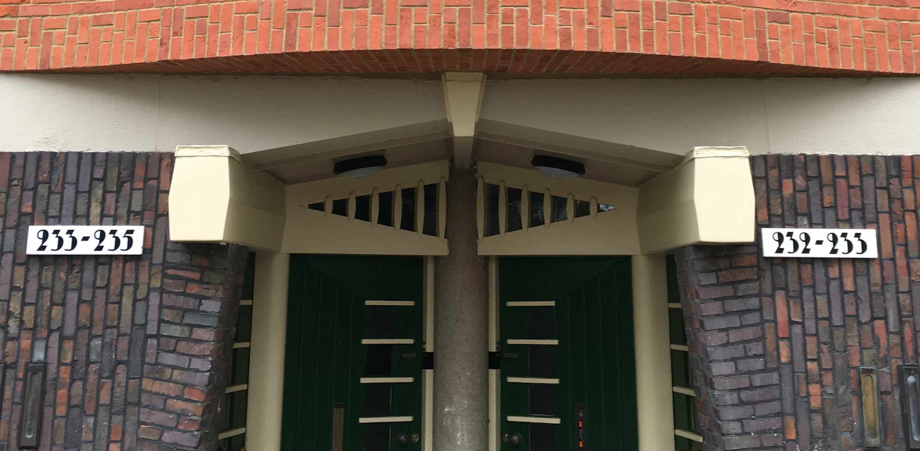
Over the past year we’ve been translating LOT61's digital brand into the physical realm and our concept for LOT61’s new 223sqm café and store is ‘Soft Angles’ – once again informed (as was the core brand) by the ‘Amsterdam School of Architecture’ – where 180° terminals are offset with 90° angles. The School’s distinctive and innovative use of bricks is reflected throughout the space and together with bespoke modular seating solutions and a selection of loose furniture selected from HAY, Vitra, Studio Form, Flos and Tonone we've created a kit-of-parts that can flex across LOT61's future hospitality roll-outs.

Brief—
Amsterdam Central Statiion's 'Doubletree by Hilton' had been searching for a new hospitality partners as they sought to elevate and set a new benchmark for both their accommodation and hospitality offering. They were set on identifying a local and independent coffee roaster that was truly rooted in the city and its coffee scene. With an enviable track record of coffee roasting (and selling beans by the tonne), a contemporary brand that featured a baked-in ‘sense of place’ LOT61 were the ideal candidate. The brand's first café (at 22sqm) located in the city's Old West was a far cry from the Hilton's 223sqm space recently vacated by Starbucks and so we were invited on board to translate LOT61's digital brand into the physical realm.
Approach—
Aside from conceiving the 'Soft Angles' concept as our golden thread our approach was based around selecting a limited but highly curated material palette to create a bespoke, modular and timeless kit-of-parts that could easily inform any future LOT61 interior project whether it was 20, 200 or 2000sqm.
Result—
If success for a new hospitality venture is measured by the line out of the door then the new LOT61 café & store are doing very nicely, thank you very much. That along with positive overheard conversations from true 'coffee heads' and Amsterdamers alike who appreciate a truly local brand being offered (and performing on) the platform it deserves seem to bode well for this new venture. LOT61 are currently in discussions with other Hilton owned properties throughout Europe and beyond who are interested in enticing the brand their way.

Inspiration
The new logotype is informed by the Amsterdam School — a style of architecture that arose in the city between 1910 and 1930. Whilst dialled up with some contemporary touches it retains its 'sense of place'. The hand drawn characters’ ‘thicks’ and ‘thins’ are all 2:1.


The Bar
—
Monolithic, sculptural and 'Instagram-able' (for those who are that way inclined) – in our eyes the oversized bar was always going to be the centrepiece or 'hearth' of the café – anchoring and visually bridging the left and right areas of the main space. The bespoke 8m long statement piece constructed of Hi-Macs is partly cantilevered and features a dog-leg that mirrors the angle of the building’s South facing facade.


Soft Angles
—
This became the bedrock of our design vision. We took the sharp angles gf the building's footprint and offset that with the soft, rounded (yet blocky at times) nature of the LOT61 logotype. The overall take-out aligns fittingly with the aesthetic of the 'Amsterdam School of Architecture;'.


Custom Seating
—
Two private seating spots with a central wooden table / A space for two strangers without having to face each other (no awkwardness) / Spaces for groups of four and eight friends / Minimal ‘moveable’ objects means a clean, tidy and efficient system / A space for a sunken planter in the elevated central section – plants to thrive from South facing windows / Plenty of options for easy and accessible power points.


Areas: Different strokes for different folk...
A key client requirement was to design a space that was wholly flexible and that could cater for and accommodate both LOT61 customers and/or Hilton guests during different times of the day. Our vision was based on creating a dynamic and sociable area to the left side of the bar whilst the right hand side of the bar would offer a quieter, co-working area where one can focus. As well as a tucked-away 'library' area this space features a long reading table that wouldn't look out of place in one of De Wallen's local ‘brown bars’.
We identified different types of customers – from the 'early bird' to the 'bookworm', the 'lunch-breaker' through to the 'freelancer' – and designed modular seating options accordingly. A mix of bespoke built-in furniture complimented with select loose furniture was imperative to not only optimise flexibility but also to ensure a rich visual layering in a space that never looks cluttered.


Pillars
—
The row of existing fair faced concrete pillars were linked with steel mesh panels, essentially creating a corridor that split the café space in two. By stripping away the steel mesh we could unify (and thus expand the space) whilst embracing and celebrating the pillars as their form work well alongside the aesthetics of the 'Amsterdam School'.

Shelving
—
A flexible shelving solution was necessary for a multiple of reasons – to showcase LOT61's coffee offering, merchandise and glassware as well as for magazines and journals in the 'library'/study area. Rather than introducing additional materials for their constructions we stuck to mild steel and brick; the 'wedding cake' brick construction houses all the merchandise whilst the slithered steel coffee totem offers a graphic showcase for the brand's coffee varietals.


Colour
As the Coffee Tasters Flavour Wheel guides all LOT61's colour choices it made sense to carry a bold colour blocking scheme into the space. The interior colours are informed by the brand's primary colour palette whilst the parasols that pepper the exterior terrace reflect the brand's coffee packaging varietals.


Exterior
Terrace
Our terrace plan offers up an additional 75+ covers from April through October. Whilst the design had to use existing built in furniture the aesthetic is largely guided by our choice of olive green HAY Palissade exterior furniture, featuring a mix of low and mid height 2 & 4 seater table options. These seating options are punctuated by custom designed planters (with integrated bins) that help zone seating areas for both comfort and privacy. The whole area can be covered by a series of eight oversized rectangular parasols that adopt and reflect LOT61’s packaging colours & tone-of-voice statements.


Disciplines
Interior Design,
Creative Direction,
Production,
Concept Creation,


