Creative Review: How to brand a place
Posted—2018-11-01
Today's place branding is about much more than logos. Creative Review spoke with Smörgåsbord on designing visual identities for countries.

Excerpt from the article:
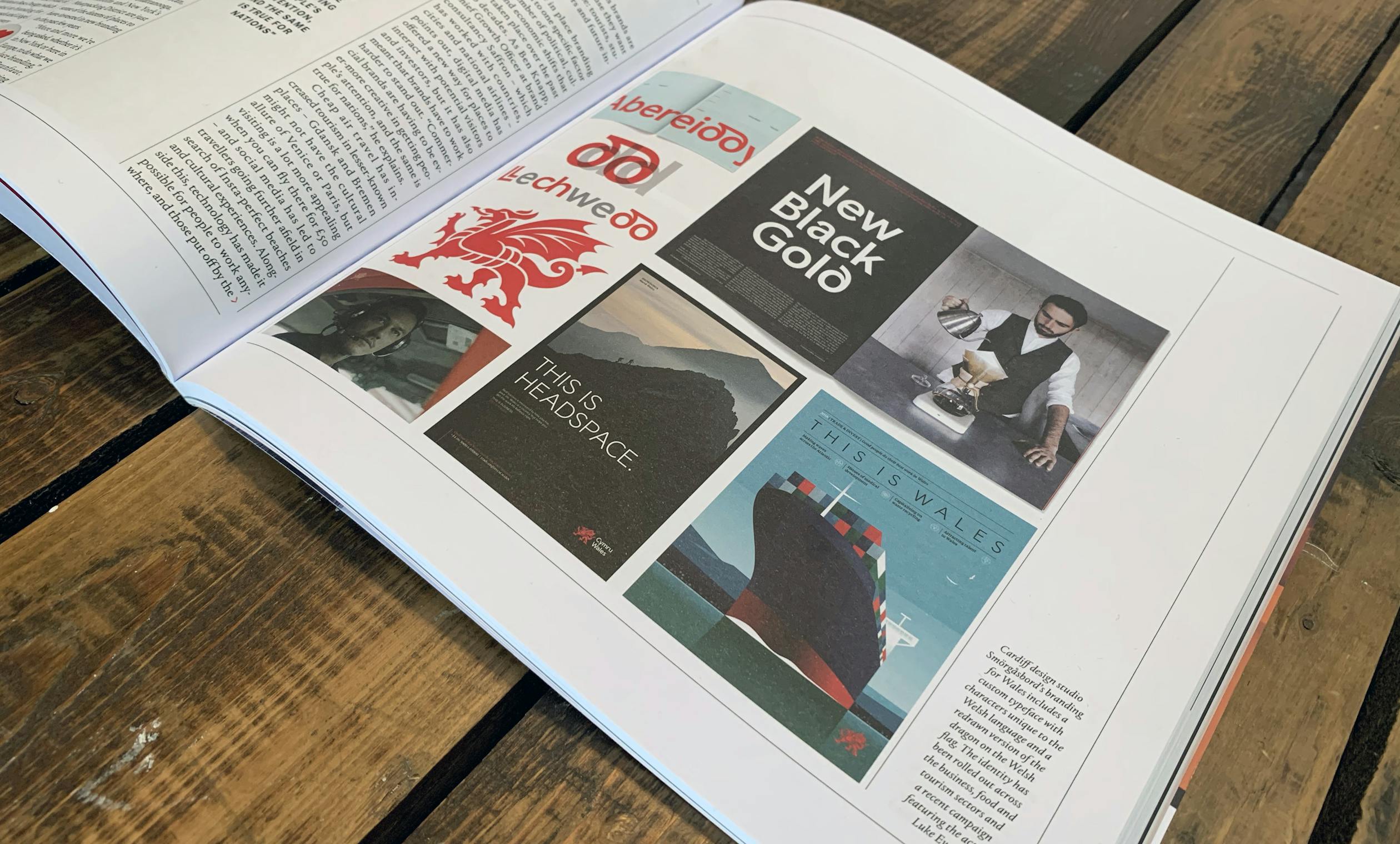
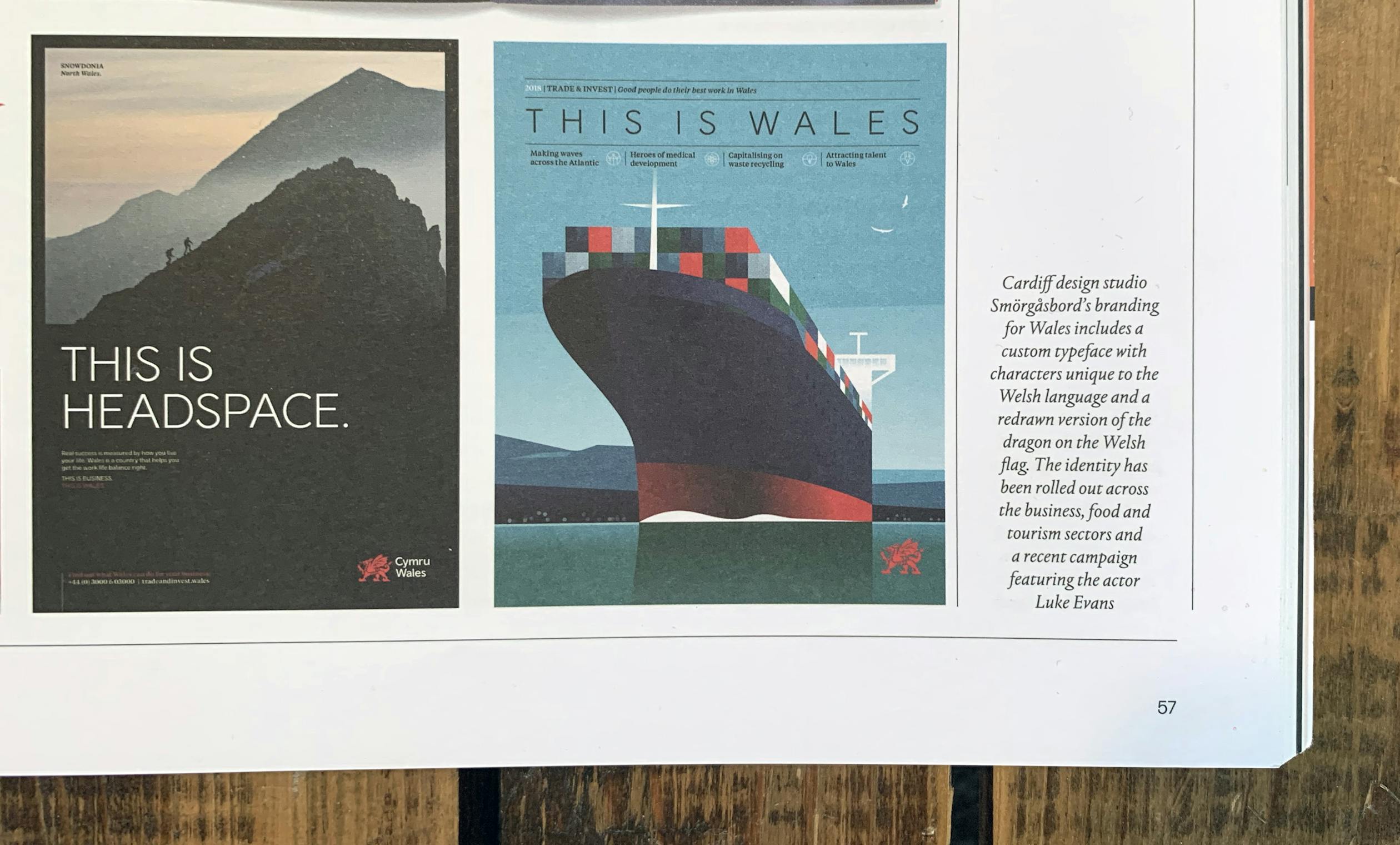
Design studio Smörgåsbord recently combined past and present in its identity for Wales, redrawing the dragon symbol on the Welsh flag and introducing a bespoke typeface with special characters for the Welsh language. Used across the tourism, business and food and drink sectors, it combines recognisably Welsh elements with more contemporary touches to create a flexible and versatile system – one that evokes a strong sense of place and national pride, and pulls off the tricky feat of looking to both the past and present.
"We decided (after a fair bit of deliberation) to focus on the 'draig' or dragon of Wales as our core marque, albeit a redrawn contemporary and reductive version,". "Some viewed this as a somewhat obvious option, but treated with the right amount of craft, it was the right option as it re-established the link with the national flag of Wales; possibly one of the most distinctive flags in the world."
The branding was launched in late 2016, and Smörgåsbord claims it has had a tangible impact: there was a 60% uplift in visitors to tradeandinvest.wales in 2017, the food and drink sector exceeded growth targets and Wales saw a 16% increate in the number of GP training places filled after the government launched a recruitment campaign featuring the new branding. The Welsh government also claims its tourism marketing has generated an extra £350 million for the country's economy.
