Transport for Wales
Branding a national transport network.
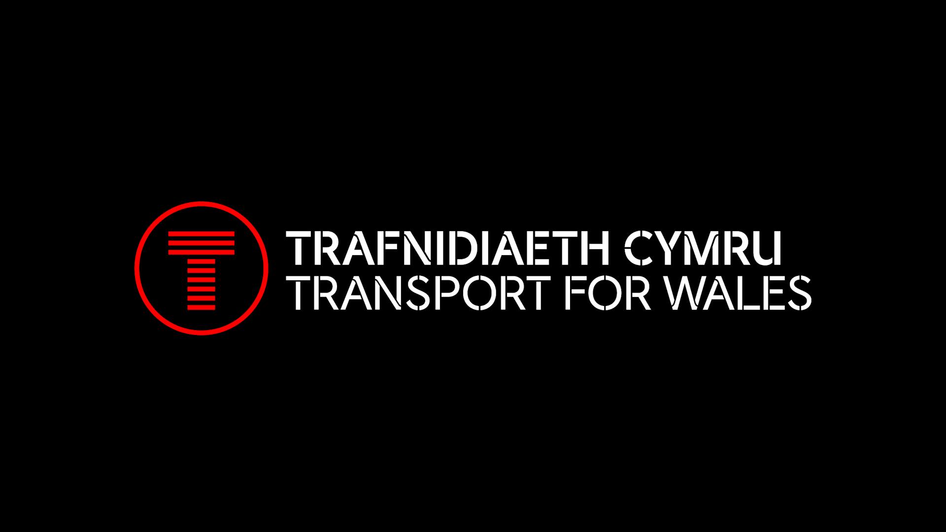
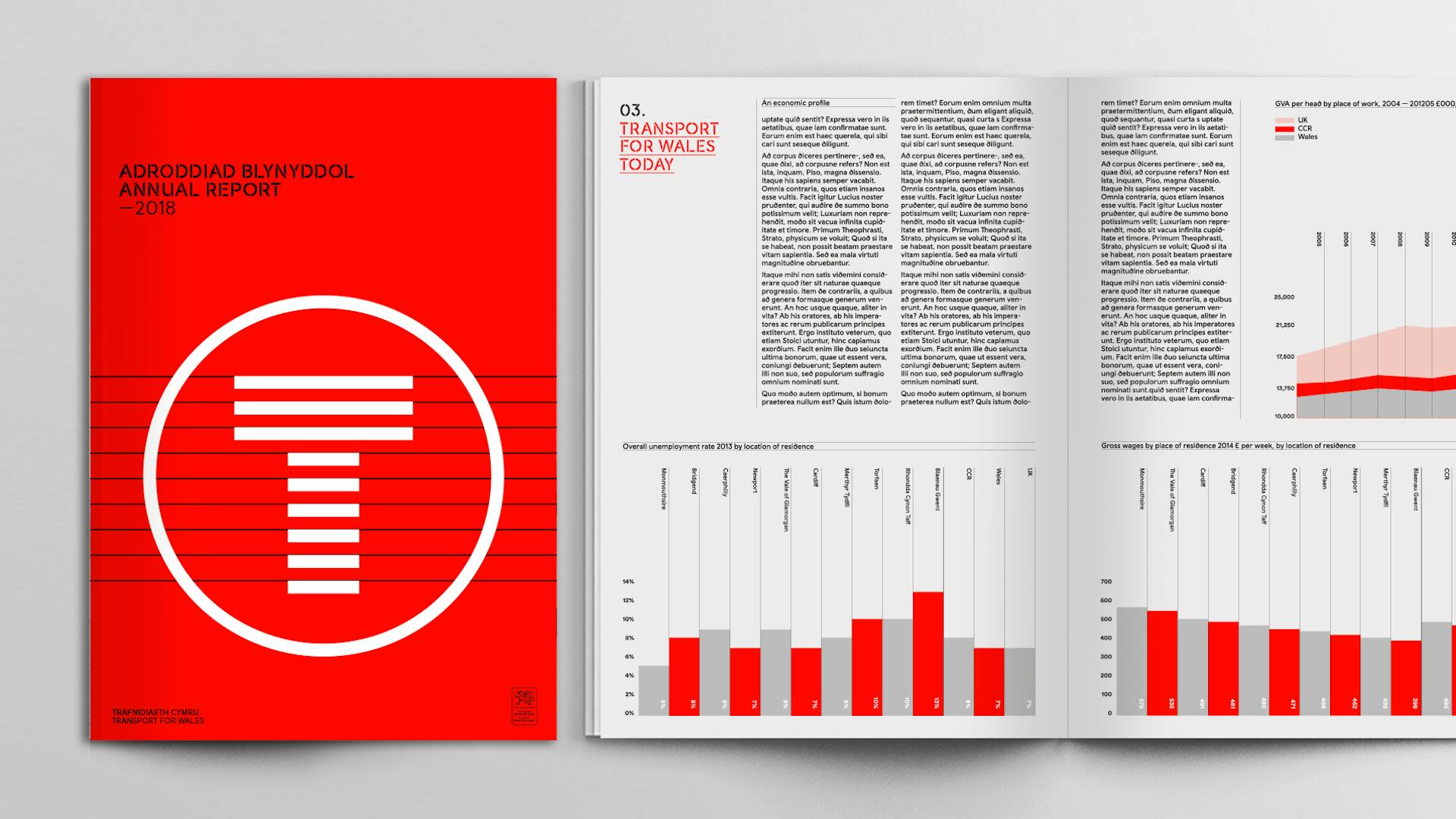
A full brand identity for the newly established national transport network. TfW was set-up by the Welsh Government in 2016 as a not-for-profit company to deliver its new vision for transport. It marks the beginning of an exciting new journey for transport in Wales.

Brief—
Smörgåsbord have been on this journey since in 2014 when we were invited to deliver a brand identity programme for the proposed South Wales Metro. In late 2016, we were appointed to create an era defining brand for the wider TfW project that would resonate with, and compliment the existing Metro and Cymru Wales nation brands, whilst having its own distinctive look and feel. The brand had to work across all touchpoints — from logotype through wayfinding & mapping to vehicle livery.
Approach—
Our starting point was ‘movement’; we designed the core marque (based on the 'T' of 'trafnidiaeth' and 'transport') to exist in perpetual motion as well as in its static form.
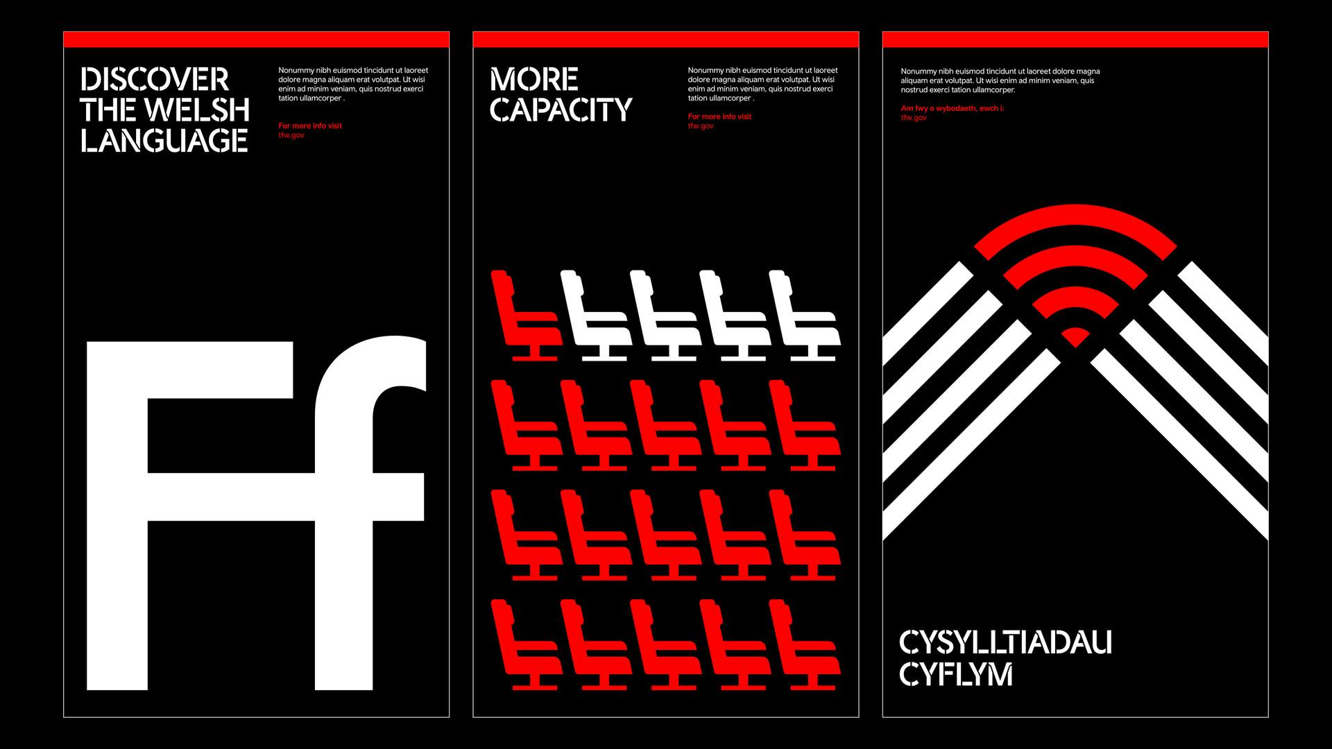
A bespoke stencil typeface followed (based on Cymru Wales Sans), and the Cymru Wales nation brand colour palette was extended with transport requirements in mind. Clear and consistent wayfinding, mapping and a comprehensive infographic system make the mundane memorable.
Result—
The brand was launched officially in June 2018 and future phases will see our design proposals and applications roll-out over a 15 – 20 year period.
The T roundel
A moving brand...
Our starting point was ‘movement’; we designed the core marque (based on the 'T' of 'trafnidiaeth' and 'transport') to exist in perpetual motion as well as in its static form.


Vehicle livery
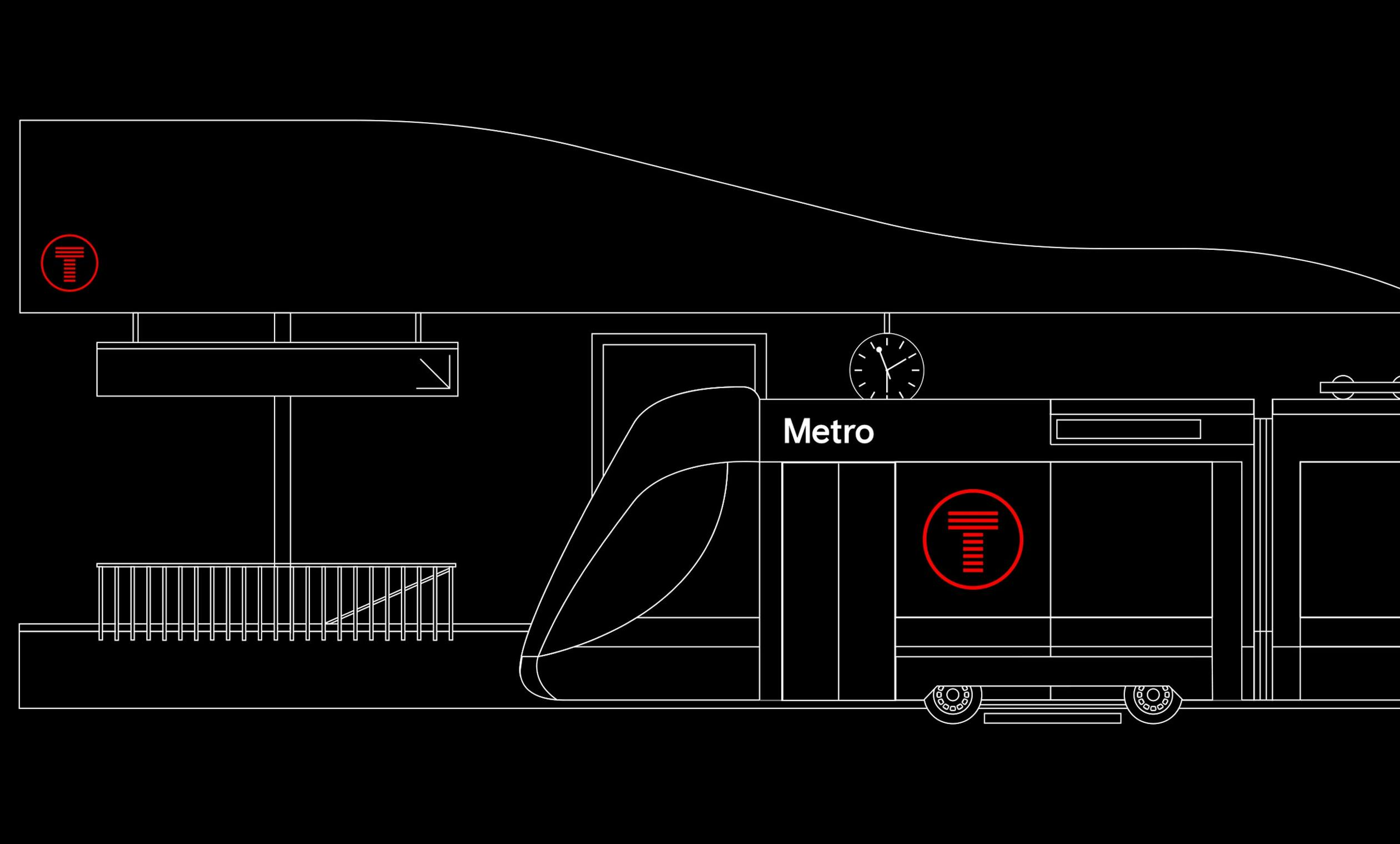
Consistency is key
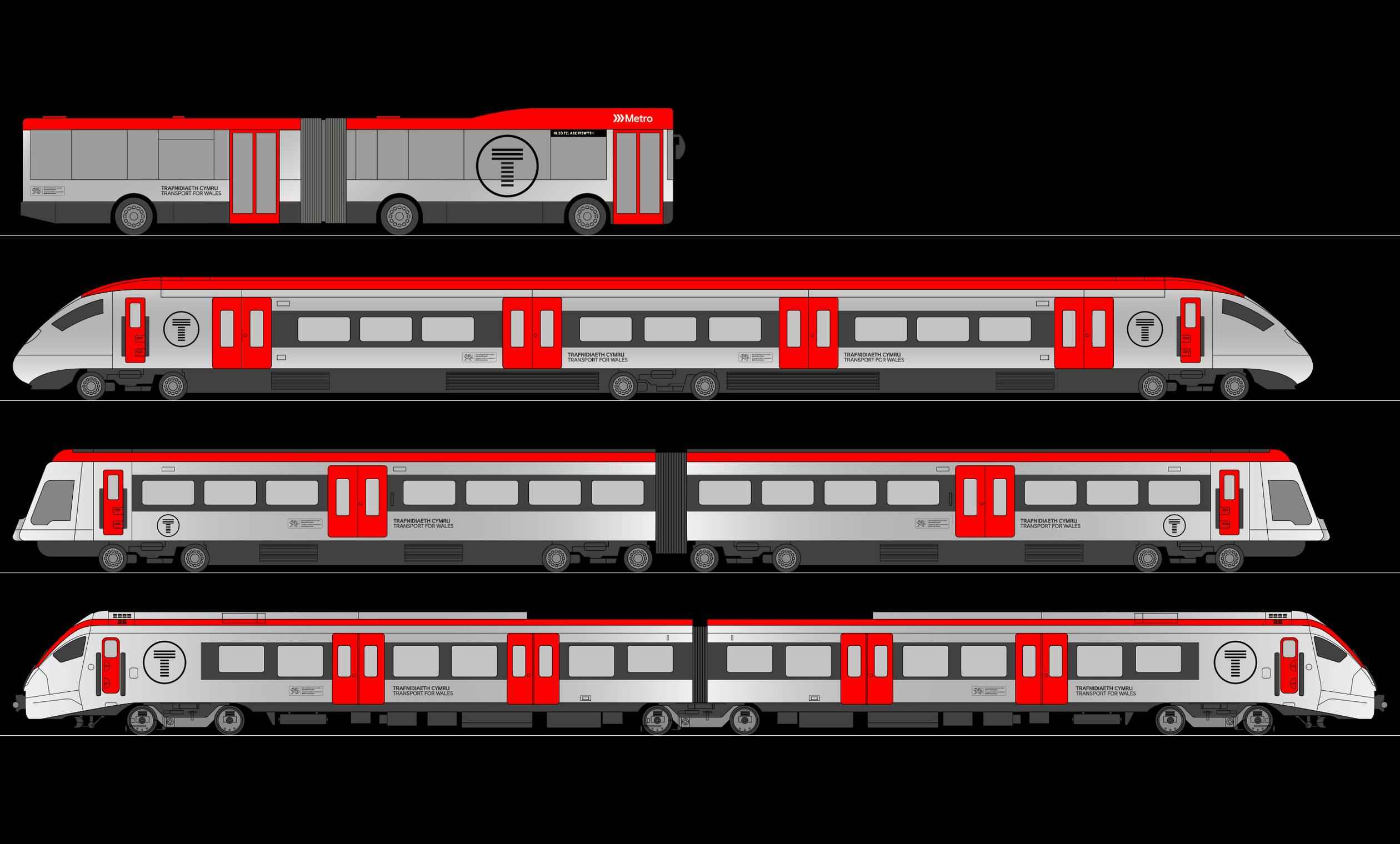
A unified livery system has been designed to roll-out across TfW's future multi-modal vehicle fleet. A base silver (or clear coated aluminium) is complimented with a gunmetal grey and the TfW coral red delineates roof lines and access & egress points.
Typography
—
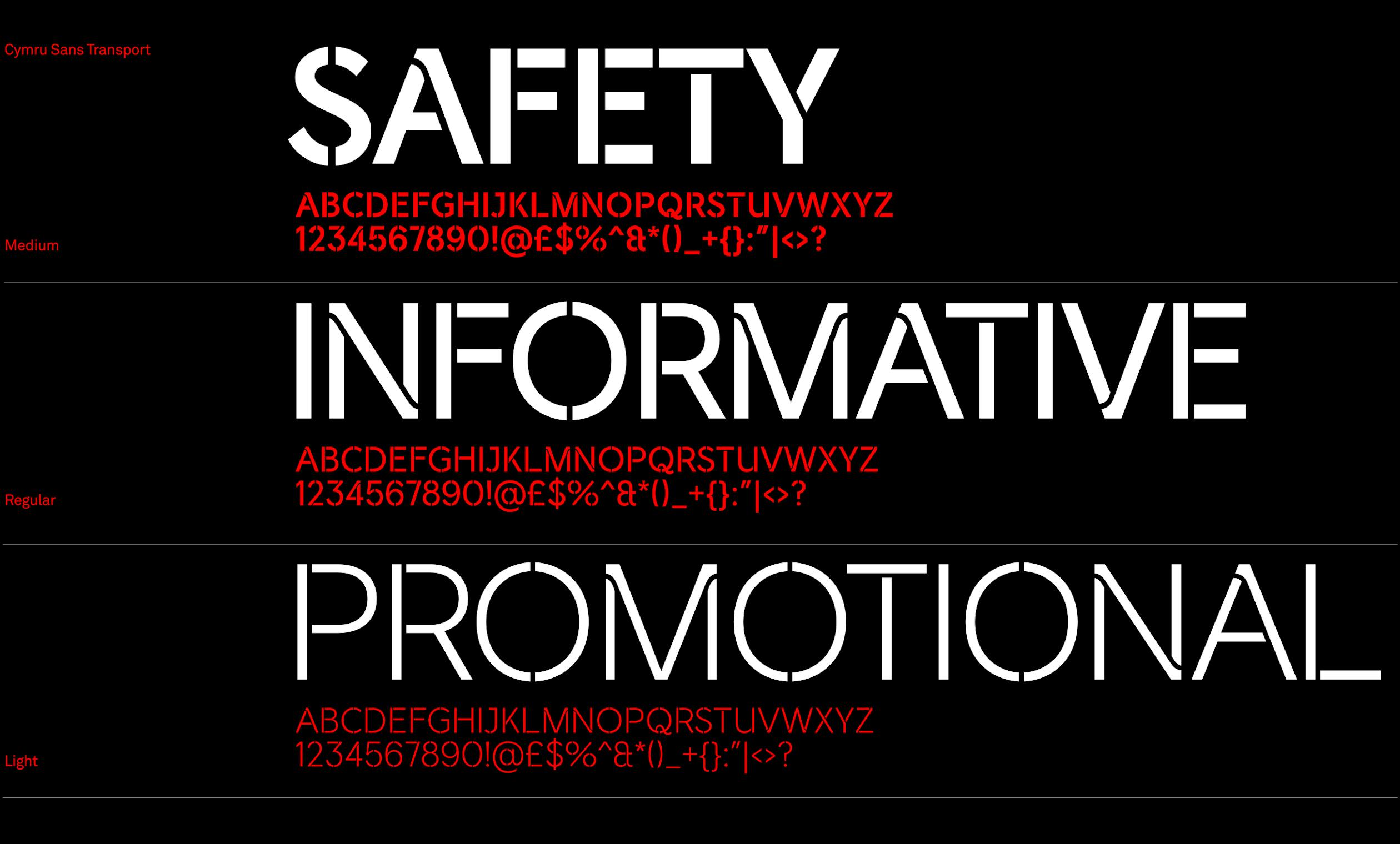
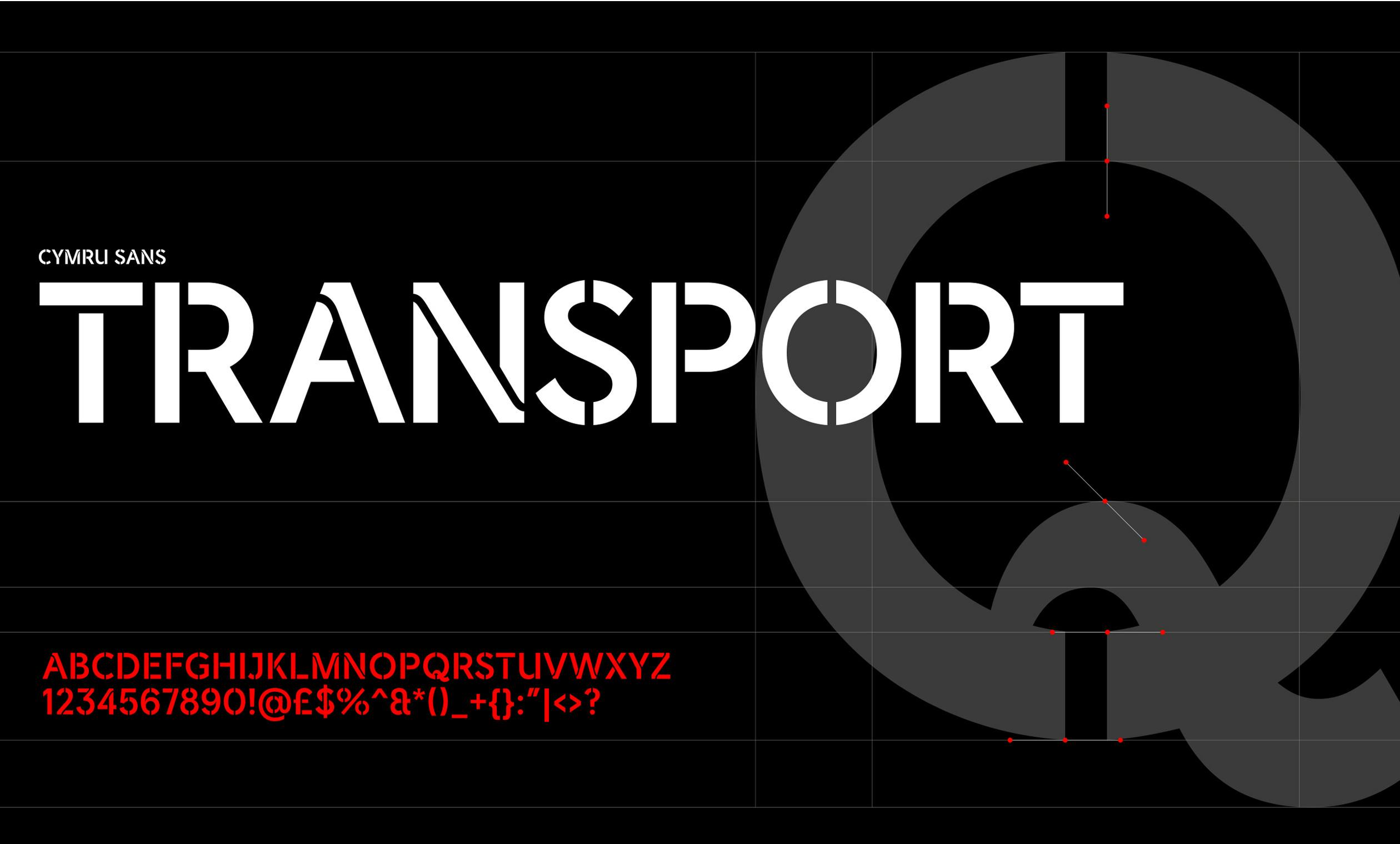
Created exclusively for TfW, 'Cymru Sans Transport' is based on 'Cymru Wales Sans' and sees the letters stencilled in a utilitarian manner which also ties in with the core 'T' roundel.
A full kit of parts
Mapping and wayfinding
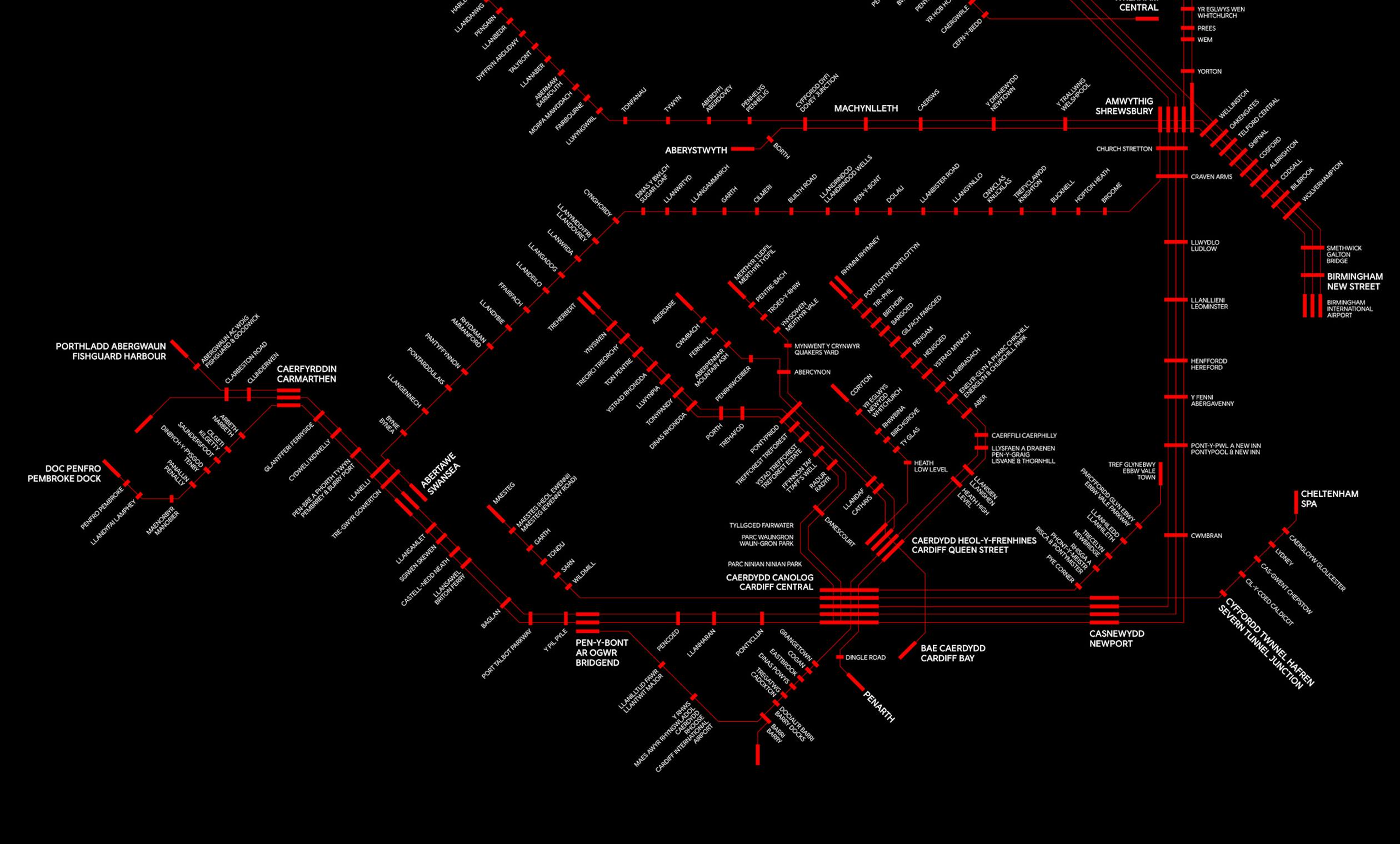
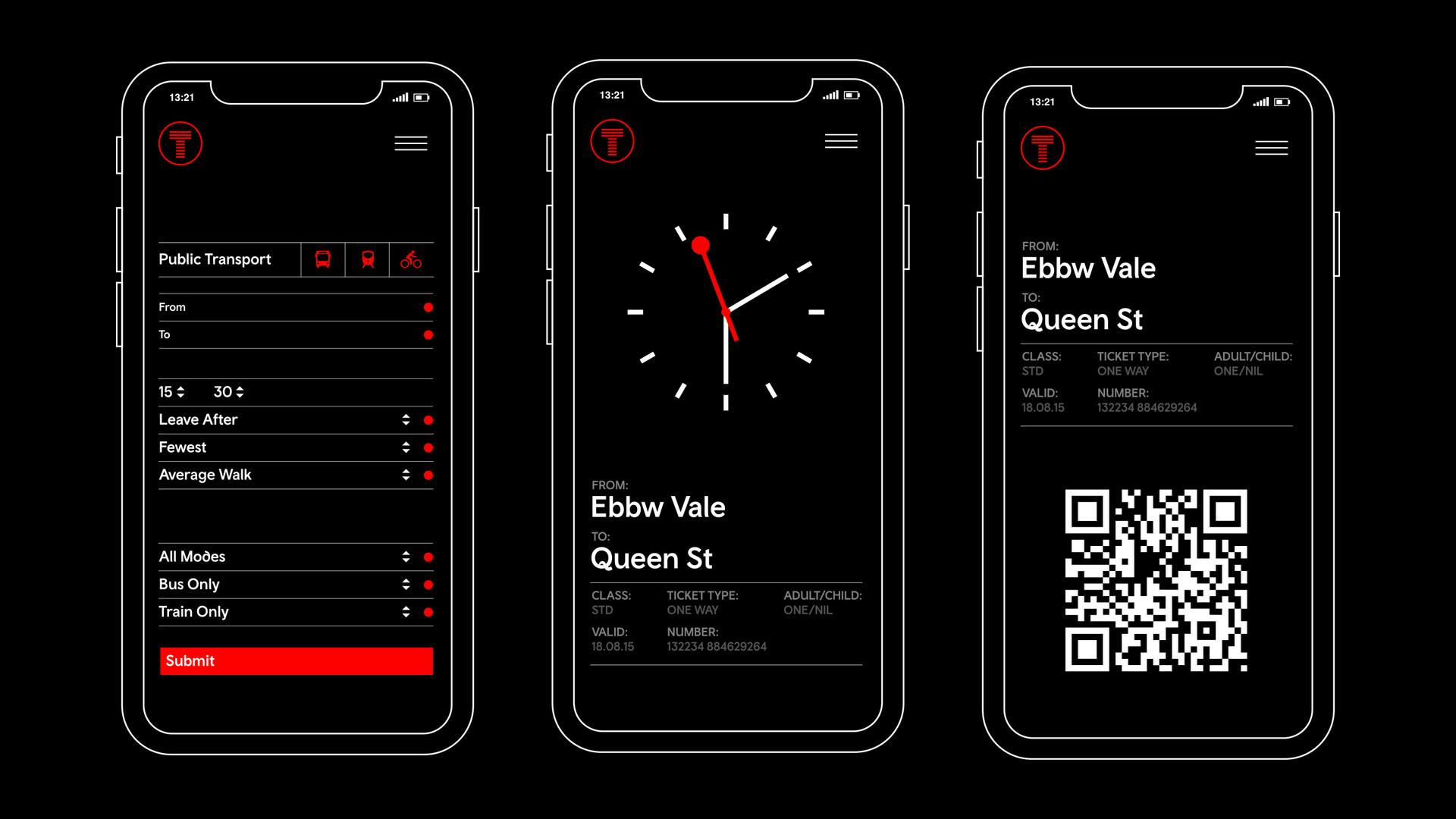
'Cymru Sans Transport' partners up with 'Cymru Wales Sans' and the nation's brand colour palette is extended with transport requirements in mind. Wayfinding, mapping and a comprehensive infographic system make the mundane memorable.

Transport Icons
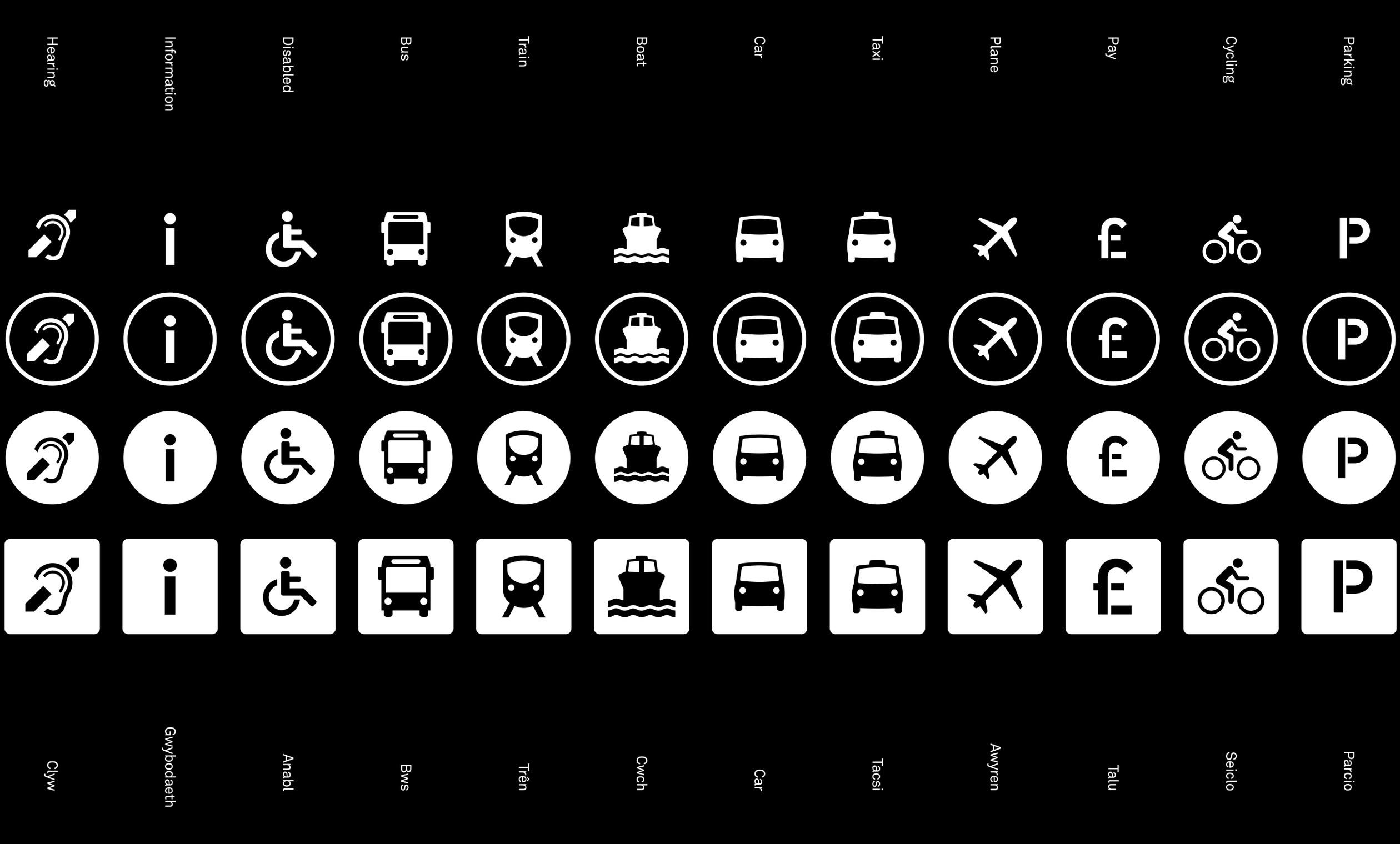
The roundel gives form to a comprehensive set of transport icons.





Disciplines
Brand Identity,
Typeface Design,
Copywriting,
Strategy,
Motion Design,
Digital,
