Inspiration
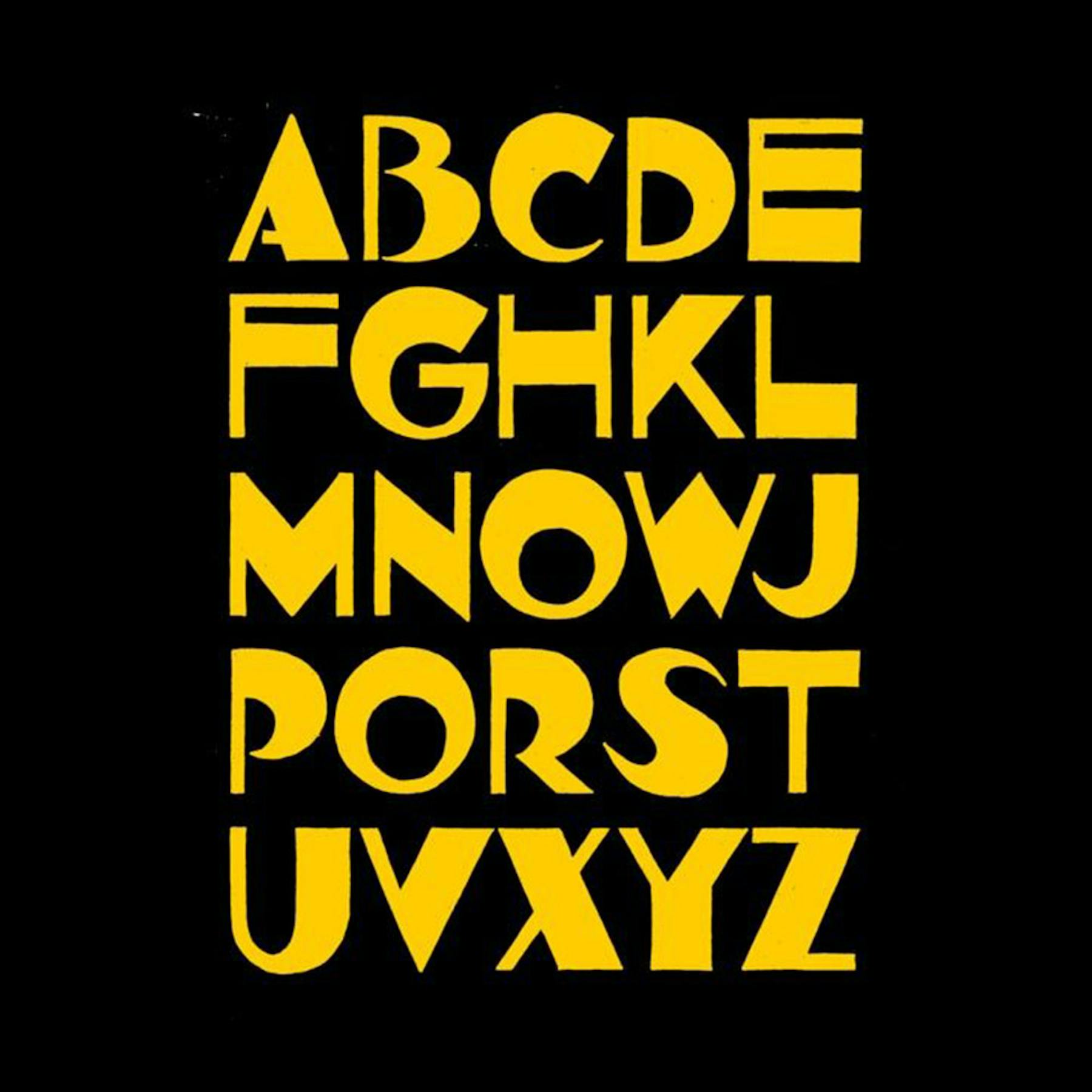
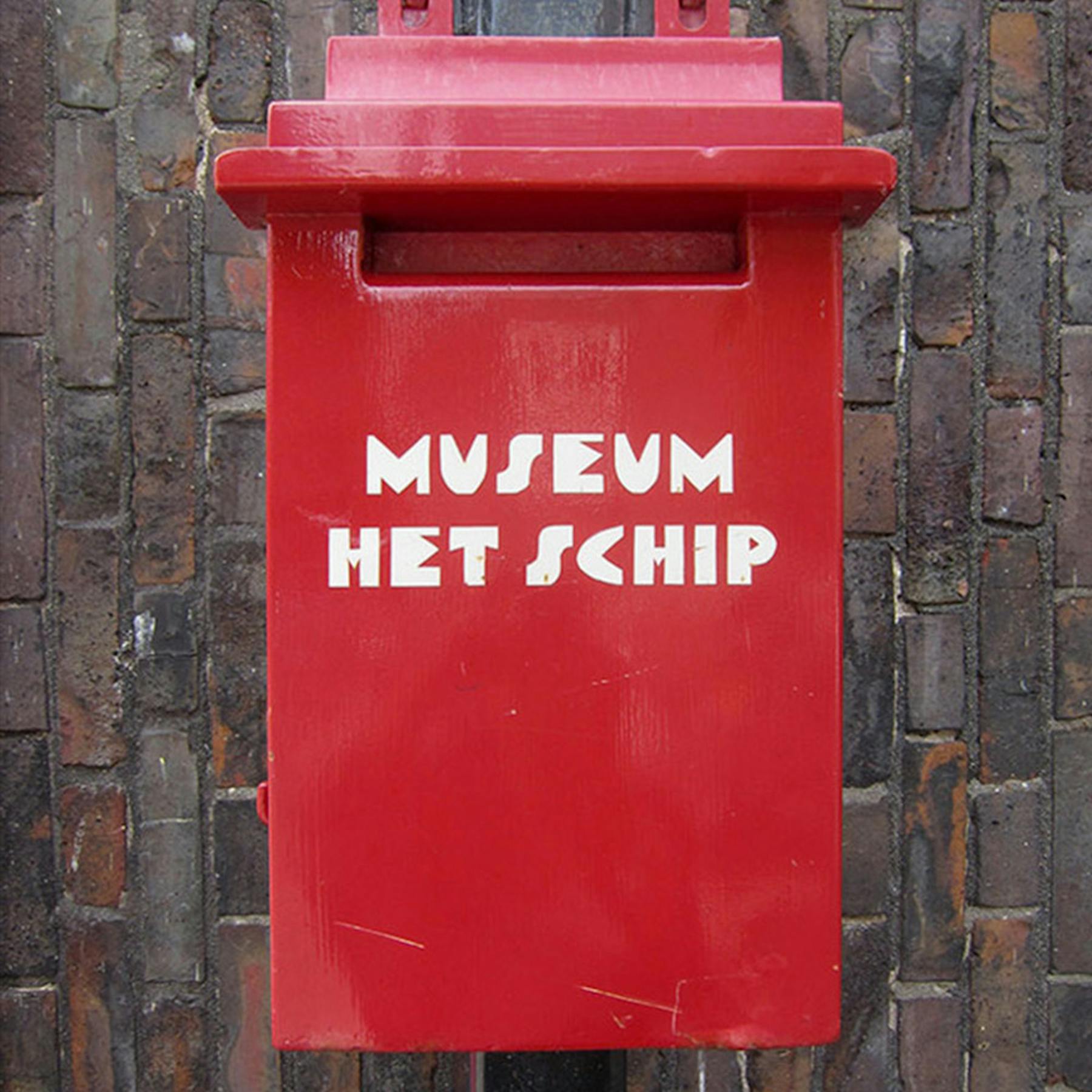
The typographical style linked with the Amsterdam School of Architecture was a fusion of German expressionism and Art Deco influences. Often playful and exuberant the typefaces provided the perfect starting point for our research.
Amsterdam based LOT61 Coffee Roasters pioneered the third wave of coffee back in the day. They invited us on board to redefine the brand and to tool it up for the next ten year plan. The new logotype is informed by the Amsterdam School — a style of architecture that arose in the city between 1910 and 1930. Whilst dialled up with some contemporary touches it retains its 'sense of place'. Full case study to follow.
The configuration of letters and numbers in LOT61 offers up a beautiful rhythm — three verticals punctuated with two circles. We were keen to move away from the typographical minimalism that is so often linked with contemporary coffee brands by creating a bold mark laden with personality.
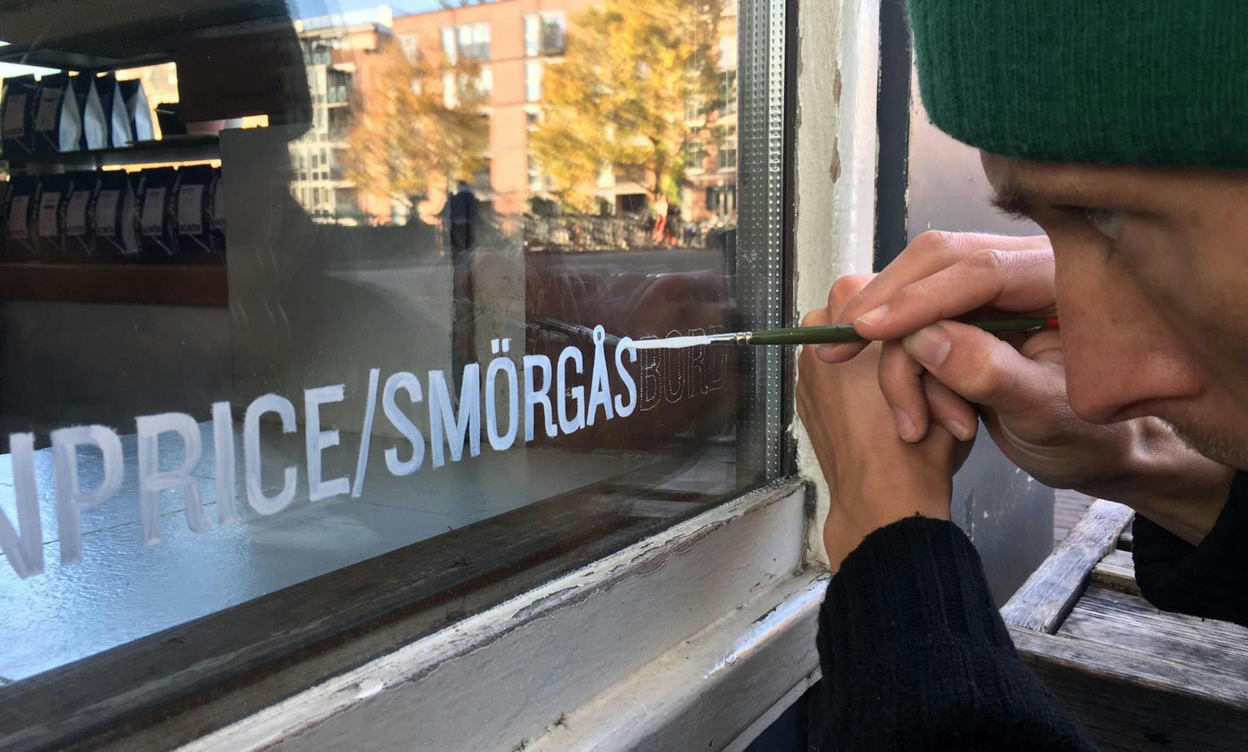
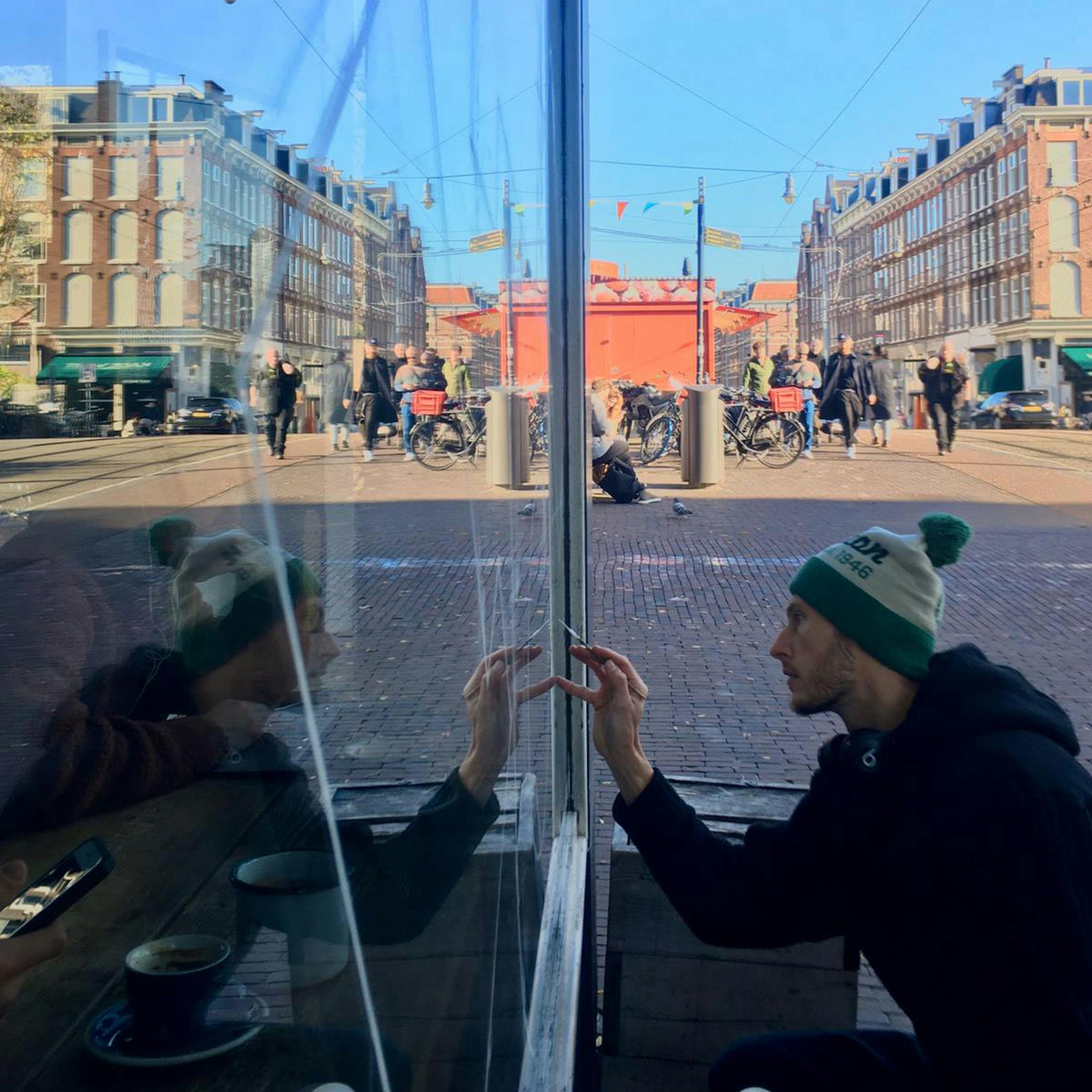
Signwriting is by local maestro Shon Price. Not a vinyl in site as Shon is committed to the paint brush.
